JQuery Mask Entry Animation
Implementation of an intro animation with clip-path mask for images using jQuery and jQuery UI, inspired by the Olivier Larose blog.
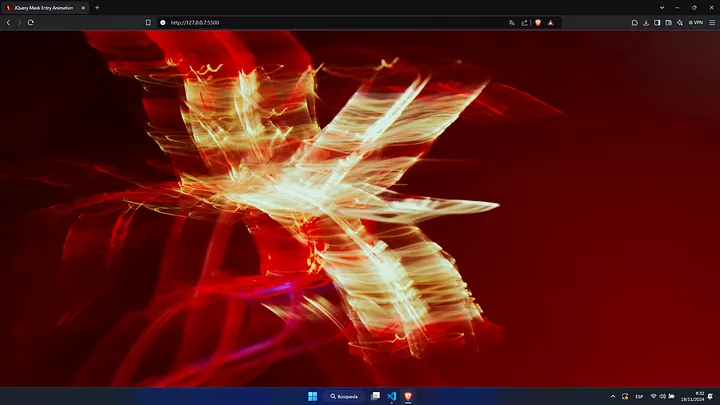
I recently published my portfolio and, looking for inspiration, I came across Olivier Larose’s blog, which became my main reference (almost a replica) for my portfolio. From him I took two main ideas: the way of presenting the projects on the main page and a post on his blog where he creates a mask with a very similar style. Here is the link to the blog in question.
As nowhere does he explain how to do it, since it is a blog related to his “Web Animation” course (which he is currently creating), I took the time to recreate it. And, although he developed it using React and Framer Motion, we will implement it with jQuery UI in a simpler way.
Primero, definiremos la estructura HTML y sus estilos en CSS. Esta estructura es bastante sencilla, ya que consiste en una imagen dentro de un contenedor. Quedaría de la siguiente manera:
<section id="home" class="home">
    <div class="home-background-container">
        <img src="https://cpadlab.github.io/src/assets/home-banner-1920.webp" sizes="100vw" alt="Fullscreen Background" loading="eager">
    </div>
</section>
The CSS shapes the .home section, assigning it a height of 100vh, which is crucial, as this will be the height of the screen that will act as the “mask”. Next, the mask container is positioned absolutely, occupying both the height and width of the .home section. The image inside this container will be automatically adjusted to cover all the available space, thanks to the width: 100% and height: 100% properties, ensuring that it fits perfectly within the defined area.
:root {
    --black-950: #000000;
    --background-color: var(--black-950);
}
body {
    background: var(--background-color);
}

::-webkit-scrollbar {
  width: 0px;
}

section.home {
    display: flex;
    flex-direction: column;
    align-items: center;
    justify-content: center;
    min-height: 100vh;
    overflow: hidden;
}

div.home-background-container {
    top: 0;
    left: 50%;
    transform: translateX(-50%);
    position: absolute;
    width: 100%;
    height: 100vh;
    overflow: hidden;
}

div.home-background-container img {
    width: 100%;
    height: 100%;
    object-fit: cover;
}
Thus, we would be left with a result like this:
Now, it’s time for the most important part. To get started with the jQuery script and jQuery UI, we must first make sure to include the necessary files in our project, so download JQuery and JQuery UI.
Next, we will add these two lines to our CSS:
div.home-background-container {
    display: none;
    clip-path: polygon(0 0, 100% 0, 100% 100%, 0% 100%);
}
To start with the animation in jQuery, let’s first make the image container visible and define the variables to control the duration and type of animation:
$(".home-background-container").css({
    display: "block"
});

const durationImage = 1400;
const easing = "easeOutCubic";
Next, we define the animateClipPath function, which allows us to animate the shape of the mask applied on the background image. The function takes a progress parameter, which represents the progress of the animation (from 0 to 1). It calculates the coordinates of the polygon points of the mask, creating a dynamic shape that changes as the animation progresses. Using jQuery, we apply these values to the image container using the clip-path property, creating a visual effect where the image appears to be revealed or “unmasked” in a fluid manner.
const animateClipPath = (progress) => {

    const x1 = 50 - 50 \* progress + "%";
    const y1 = 25 - 25 \* progress + "%";
    const x2 = 50 + 50 \* progress + "%";
    const y2 = 35 \* (1 - progress) + "%";
    const x3 = 50 + 50 \* progress + "%";
    const y3 = 75 + 25 \* progress + "%";
    const x4 = 50 - 50 \* progress + "%";
    const y4 = 65 + 35 \* progress + "%";

    $(".home-background-container").css({
        "clip-path": \`polygon(${x1} ${y1}, ${x2} ${y2}, ${x3} ${y3}, ${x4} ${y4})\`
    });

};
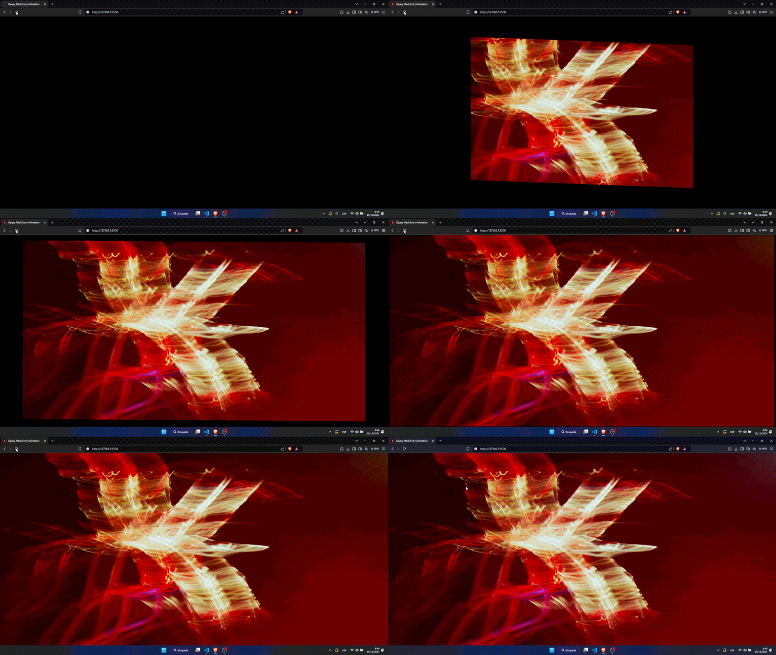
Finally, we apply with juqery ui the animation and finally we would have our result:
$({ progress: 0 }).animate({ progress: 1 }, {
    duration: durationImage,
    easing: easing,
    step: animateClipPath
});
This is the result:
<3 Carlos