Awesome GSAP Section Transition
Implementation of a transition between sections using React and TailwindCSS, inspired by Jack Elder.

> Before we start, a little warning: in this post I explain how to implement the effect in both standard HTML and React. Note that the CodePen live demo is made with pure HTML, CSS and JavaScript, while the repository on GitHub uses TailwindCSS and React (with Vite).
Recently, I decided to redesign my father’s website. This website was my first “serious” project when I started web development in 2023. Since then, I’ve learned a lot about new technologies such as React, jQuery, TailwindCSS, GSAP, among others, so I set out to redo it taking advantage of all this new knowledge. Although this redesign will be a case study that I will address soon, today I want to focus on something specific: the effect I implemented with GSAP for each section of the page.
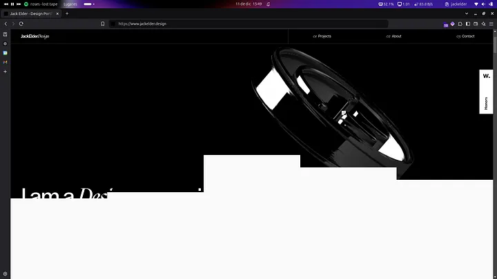
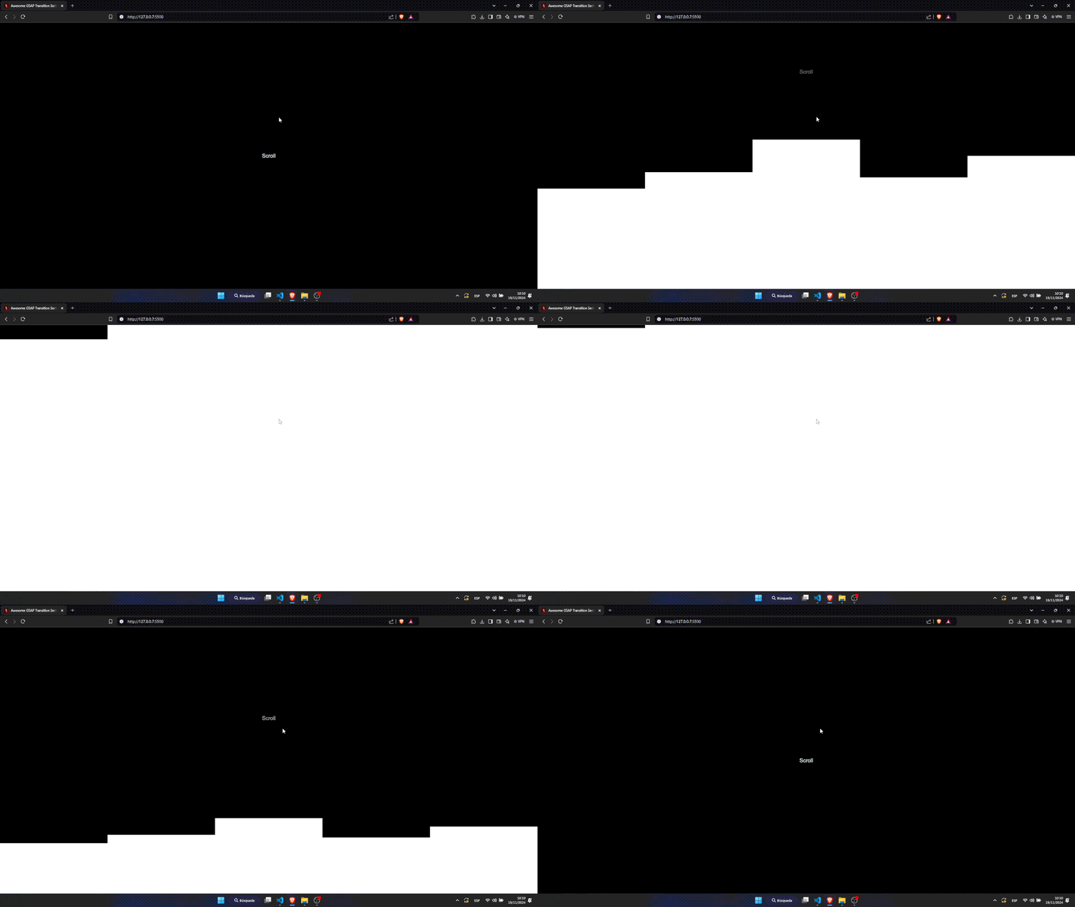
The effect consists of a fade-out of the previous section while the new section, with a high-contrast background, gradually appears. In this transition, several rectangles in grid composition unfold smoothly and attractively.
I discovered this effect while exploring Jack Elder’s portfolio, one of the best portfolios I’ve seen so far. On his website, it looks something like this:
On my father’s website, I managed to implement it, giving the following result:
But how is it done? The theory is simple, you just need GSAP and ScrolTrigger. First you need to create the previous section, which in this case will be like this:
<style>
    section.separator {
        height: 100vh;
        display: flex;
        align-items: center;
        justify-content: center;
    }
</style>

<section class="separator">
    <p>Scroll</p>
</section>
And then, in the new section (where the transition will be created), you must add the following html:
<section class="content">
    <div class="section-transition">
        <div class="section-transition-div" id="section-transition-div\_1"></div>
        <div class="section-transition-div" id="section-transition-div\_2"></div>
        <div class="section-transition-div" id="section-transition-div\_3"></div>
        <div class="section-transition-div" id="section-transition-div\_4"></div>
        <div class="section-transition-div" id="section-transition-div\_5"></div>
    </div>
    <div class="section-content"></div>
</section>
Adding this css:
section.content {
    position: relative;
    z-index: 1;
}

main section.content div.section-content {
    background: var(--white-050);
    height: 100vh;
}

main section.content div.section-transition {
    display: grid;
    grid-template-columns: repeat(5, 1fr);
    position: absolute;
    width: 100%;
    height: auto;
    left: 0;
}

main section.content div.section-transition {
    bottom: 100%;
    align-items: end;
}

main section.content div.section-transition div.section-transition-div {
    height: 0px;
    background: var(--white-050);
}
Finally, you should add some javascript and this way you will have your effect in pure HTML and JS:
gsap.registerPlugin(ScrollTrigger);

gsap.to(".separator", {
    scrollTrigger: {
        trigger: ".separator",
        scrub: true,
        start: 'bottom bottom',
        end: 'bottom +=100',
    },
    opacity: "0",
    ease: 'none',
});

gsap.to("#section-transition-div\_1", {
    scrollTrigger: {
        trigger: ".separator",
        scrub: true,
        start: 'bottom bottom',
        end: 'bottom +=100',
    },
    height: "100px",
    ease: 'none',
});

gsap.to("#section-transition-div\_2", {
    scrollTrigger: {
        trigger: ".separator",
        scrub: true,
        start: 'bottom bottom',
        end: 'bottom +=100',
    },
    height: "200px",
    ease: 'none',
});

gsap.to("#section-transition-div\_3", {
    scrollTrigger: {
        trigger: ".separator",
        scrub: true,
        start: 'bottom bottom',
        end: 'bottom +=100',
    },
    height: "400px",
    ease: 'none',
});

gsap.to("#section-transition-div\_4", {
    scrollTrigger: {
        trigger: ".separator",
        scrub: true,
        start: 'bottom bottom',
        end: 'bottom',
    },
    height: "200px",
    ease: 'none',
});

gsap.to("#section-transition-div\_5", {
    scrollTrigger: {
        trigger: ".separator",
        scrub: true,
        start: 'bottom bottom',
        end: 'bottom +=100',
    },
    height: "300px",
    ease: 'none',
});
Doing it in React and TailwindCSS is just as easy, even easier. You only have to create the project and install the dependencies:
╰─ npm create vite@latest
... # Add the Project name & Select React
╰─ npm install
╰─ npm install -D tailwindcss postcss autoprefixer
╰─ npx tailwindcss init -p
\# Add the Tailwind settings
╰─ npm install gsap
And directly in the App.jsx file, copy the following code:
import React, { useEffect, useRef } from 'react'
import gsap from "gsap"
import ScrollTrigger from "gsap/ScrollTrigger"

function App() {

    const transitionDivsRef = useRef(\[\]);
    const seperatorSection = useRef(null);

    useEffect(() => {

        gsap.registerPlugin(ScrollTrigger);

        transitionDivsRef.current.forEach((div, index) => {

            const heights = \[100, 200, 400, 200, 300\];

            gsap.to(div, {
                scrollTrigger: {
                    trigger: seperatorSection.current,
                    scrub: true,
                    start: 'bottom bottom',
                    end: 'bottom +=100',
                },
                height: \`${heights\[index\]}px\`,
                ease: 'none',
            });
        });

        gsap.to(seperatorSection.current, {
            scrollTrigger: {
                trigger: seperatorSection.current,
                scrub: true,
                start: 'bottom bottom',
                end: 'bottom +=100',
            },
            opacity: 0,
            ease: 'none',
        });

    }, \[\]);

    return (
        <>
            <main>

                <section ref={seperatorSection} className="h-screen flex items-center justify-center">
                    <p className="text-white font-sans text-xl">Scroll</p>
                </section>

                <section className="relative z-10">
                    <div className='grid grid-cols-5 absolute w-full h-auto left-0 bottom-full items-end'>
                        {\[...Array(5)\].map((\_, index) => (
                            <div key={index} ref={(el) => (transitionDivsRef.current\[index\] = el)} className="bg-white h-0"></div>
                        ))}
                    </div>
                    <div className='bg-white h-screen'></div>
                </section>

            </main>
        </>
    )
}

export default App
Finally, this is the result:
<3 Carlos